![[Experimental]](figures/lifecycle-experimental.svg)
Usage
bintime_plot(
  obj,
  analyte,
  method = "kmeans",
  time = "TAFD",
  color = NULL,
  facet = "DOSE",
  min_time = NULL,
  max_time = NULL,
  points = FALSE,
  cfb = FALSE,
  caption = TRUE,
  title = NULL,
  size = 1.5,
  alpha = 1,
  scales = "fixed",
  refline = NULL,
  legend = TRUE
)
Arguments
- obj
A nif object.
- analyte
The analyte as character.
- method
Univariate class intervals method, can be one of jenks, kmeans, pretty, quantile, hclust, sd, bclust or fisher. See classInt::classInterval() for details.
- time
The time field.
- color
The coloring field.
- facet
The faceting field, defaults to DOSE.
- min_time
The minimal time, as numeric.
- max_time
The maximal time, as numeric.
- points
Plot original data points as logical.
- cfb
Plot change from baseline, as logical.
- caption
Show caption as logical.
- title
The plot title, as character. If none is provided, a generic title based on the analyte will be chosen. Override this by setting title = "", if needed.
- size
The point size.
- alpha
The alpha parameter for the data points.
- scales
The scales parameter to facet_wrap.
- refline
Plot horizontal dashed reference lines at these y axis values, defaults to NULL (no lines).
- legend
Show legend.
Examples
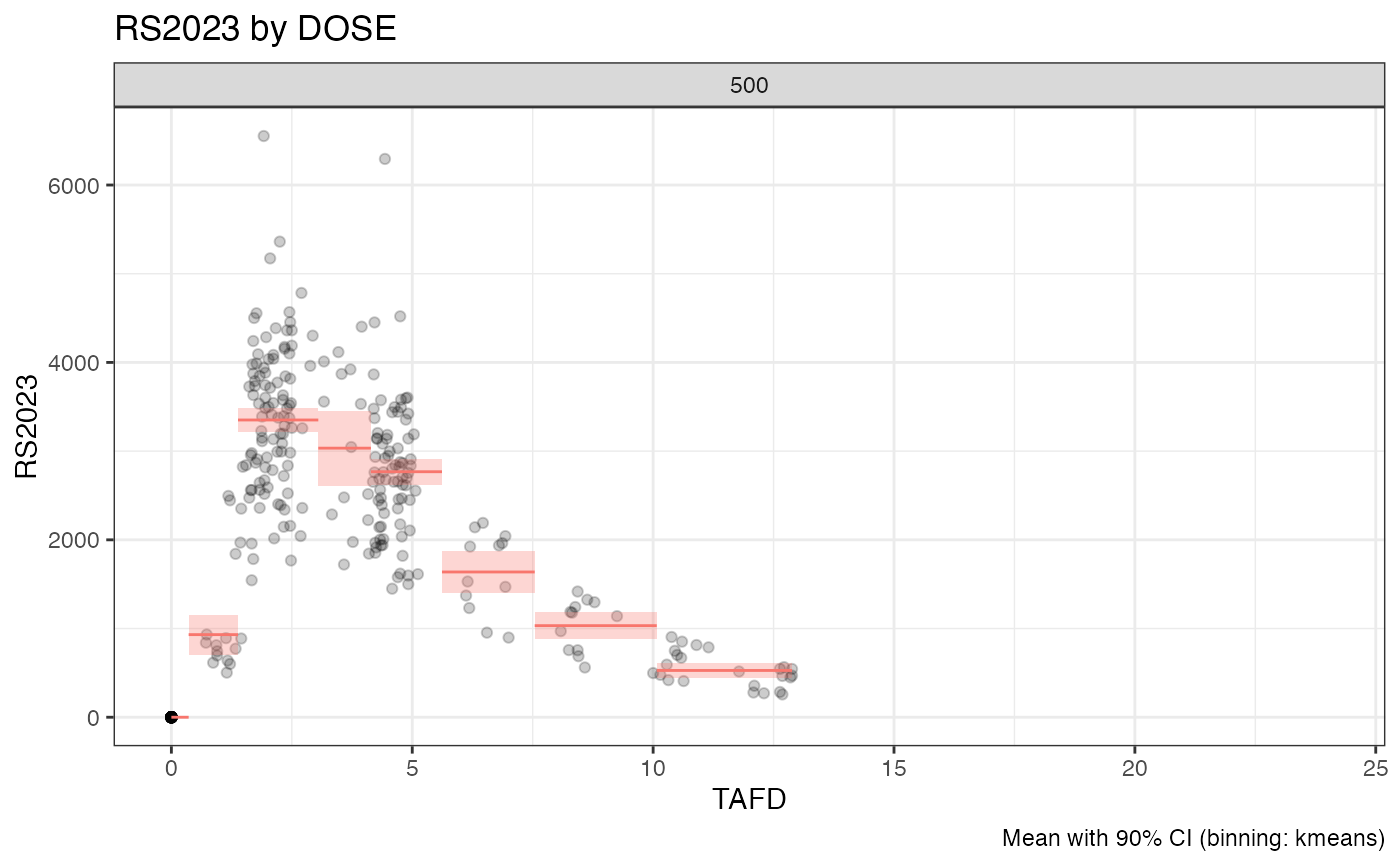
examplinib_poc_nif |>
  dplyr::filter(TAFD < 48) |>
  bintime_plot("RS2023", points = TRUE, alpha = 0.2)